Grid Layout

Why to do element alignment in complex way using flexbox when you have Grid layout in CSS, also flexbox is only good for 1-D either in horizontal or vertical, But in Grid layout you can control elements position in 2-D How ? Let’s find it out.
In this guide I will help you to under Grid layout in simple and easy language that a beginner guy can easily follow up. But first we have to understand some terminology in Grid layout.
What is Grid Layout?
a powerful two-dimensional layout system that allows you to align elements into complex columns and rows.
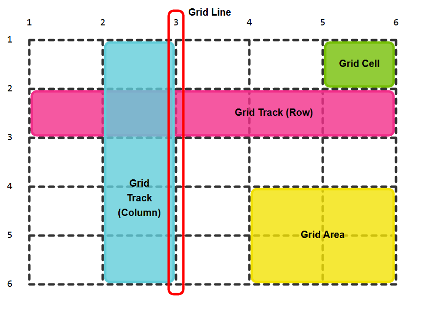
Grid Line - The vertical lines of the grid layout which used for targeting
Grid cells. Grid line present in both direction and can have positive (forward track) and negative value ( backward track)Grid Track - one entire row or column called Grid Track.
Grid Cell - the smallest part of Grid.
Grid Area - when you element take more then one Grid cell then that total grid cells called Grid Area.
How to Implement ?
Just like we did in Flexbox , target the parent assign it display : grid ; and assin the grid properties to parents and child.
For Parents properties (Grid Container) :
“parents decides structure , size and alignment rules”
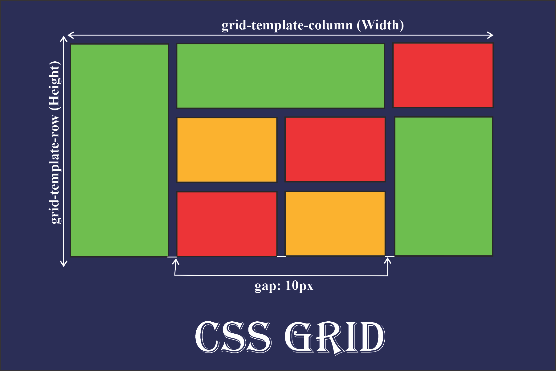
display : grid ;activate grid layout.grid-template-columns :define columns structure (count and size.)grid-template-rows:define the rows structure (count and size )grid-template:shorthand of grid-template rows and grid-template columns.syntax:
grid-template: gird-template-rows / grid-template-columns
example:
.parent{
        display: grid ;
<!-- will create 3 columns where first 2 columns have 25% width and 3rd one has 50% -->
        grid-template-columns: 25% 25% 50% ;
<!-- will create 2 rows with 100px and 3em height -->
        grid-template-rows : 100px 3em ;
now you are thinking what will we do, if we want to create 10 columns with 100px ? do we have to write grid-template-columns: 100px , 100px…………………….. ( 10th time ).
The answer is no. we have repeat() to tackle with this.
grid-template-columns: repeat( count , size )grid-template-rows: repeat( count , size )
<!-- will create 10 columns with 100px width. -->
grid-template-columns: repeat( 10 , 100px );
<!-- will create 4 rows with 200px width. -->
grid-template-rows: repeat( 4 , 200px )
fr unit:
For Child properties (Grid item ) :
“child decides where it sits, not what the grid looks like.”
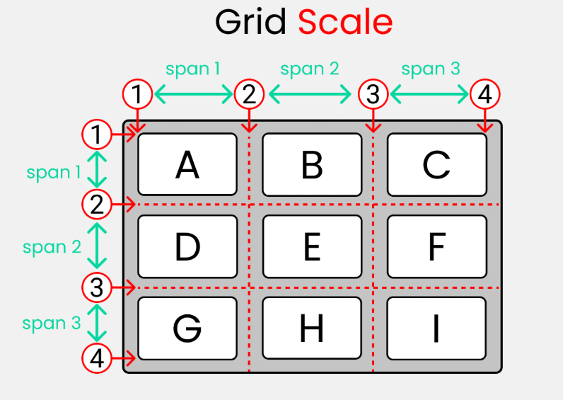
grid-column
Chooses start/end column lines.

grid-row
Chooses start/end row lines.

grid-column-start / grid-column-end
Explicit column control.

grid-row-start / grid-row-end
Explicit row control.

grid-area
grid-column-start :alone grid-column-start will span grid item by default one column.grid-column-end :used for expand thegrid-column-startspan area.grid-row-start :andgrid-rows-end:just likegrid-column-startandendfor rows.
Tips :
Tired using grid-column-start, grid-rows-start and their ends, repeatedly ? we also have a short hands :
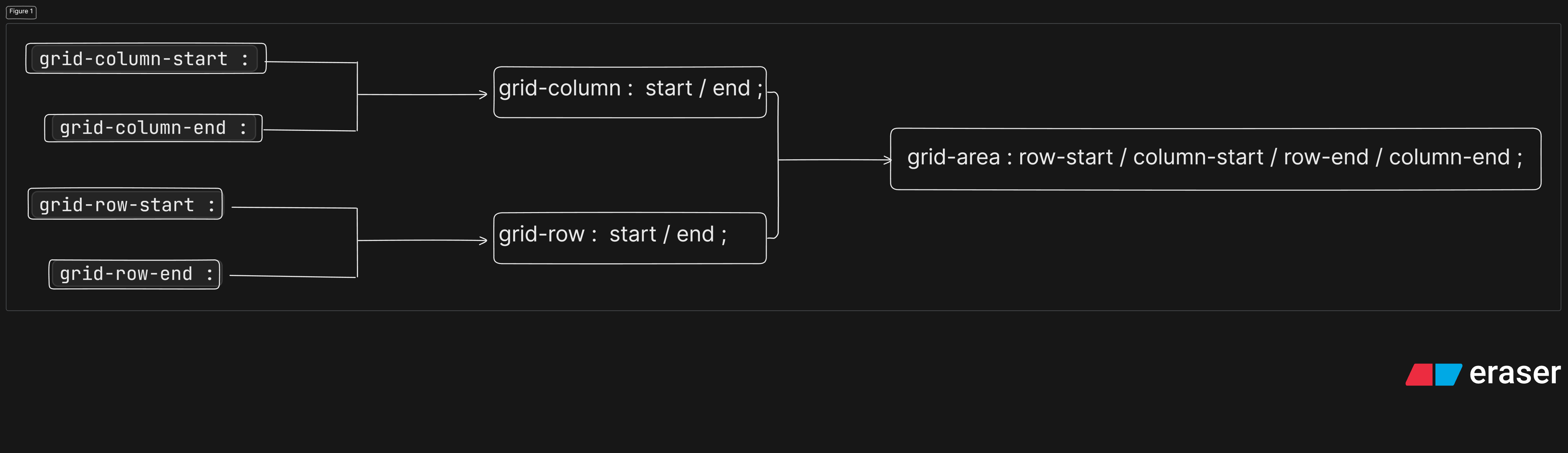
grid-column: start / end ;grid-row : start / end ;
span
order
Conclusion
Flexbox has some limitation which is resolved by Grid layout, its a vast topic and you can explore it more but don’t forget you main purpose why you come here for. if you are a beginner than i will suggest this much content if sufficient for you to implement grid in your project.
Once you get comfortable with all this property then go into more deep in grid layout.
Highly recommended
check it out this awesome game here you can learn about this property concept easily :
Thanks for your valuable time :)